All Images
Image 1 of 1: ‘RStudio interface screenshot showing four panes.’
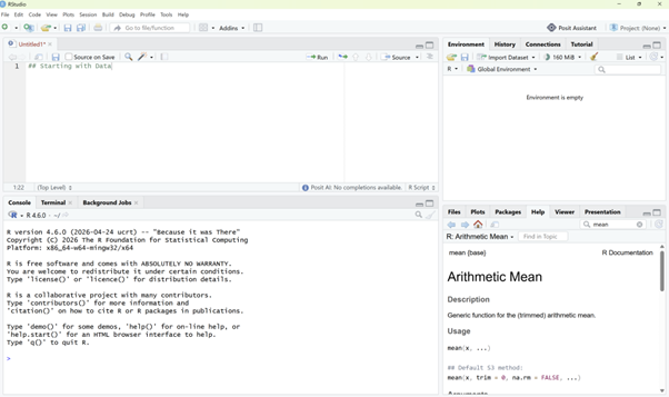
RStudio interface screenshot. Clockwise from top
left: Source, Environment/History, Files/Plots/Packages/Help/Viewer,
Console.
Image 1 of 1: ‘RStudio preferences screenshot showing the workspace saving option set to Never.’
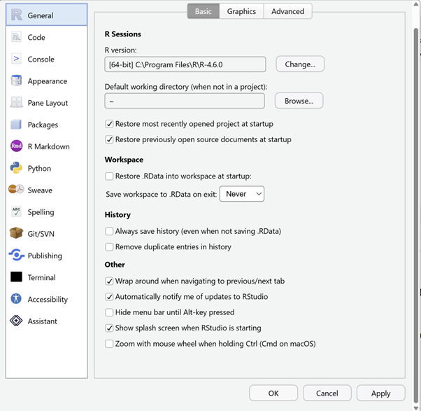
Set ‘Save workspace to .RData on exit’ to
‘Never’
Image 1 of 1: ‘Screenshot of the expected working directory structure.’
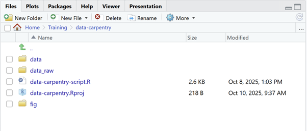
Image 1 of 1: ‘Diagram of the file structure to recreate.’
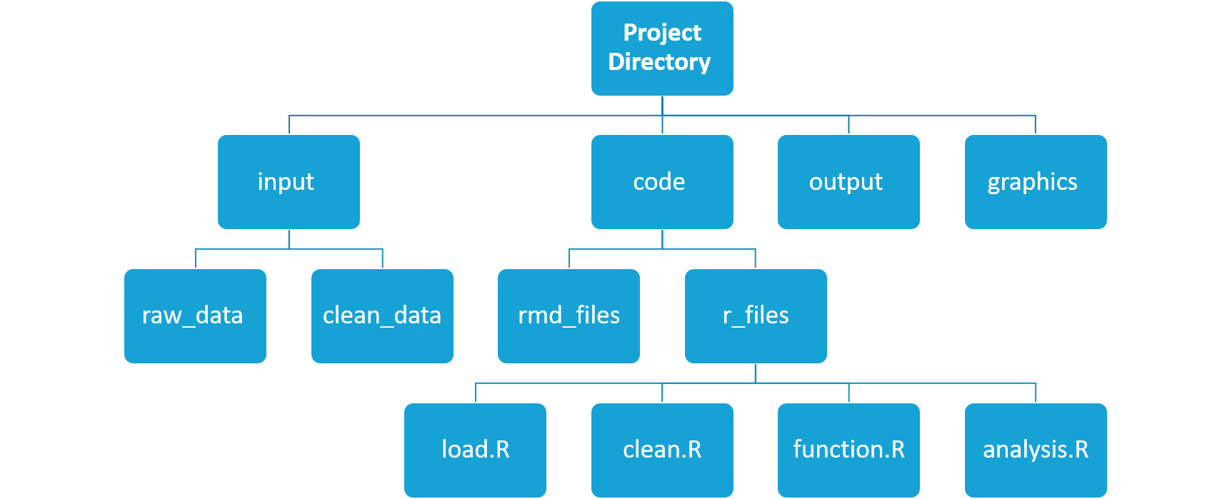
Image 1 of 1: ‘Screenshot of the RStudio help interface.’
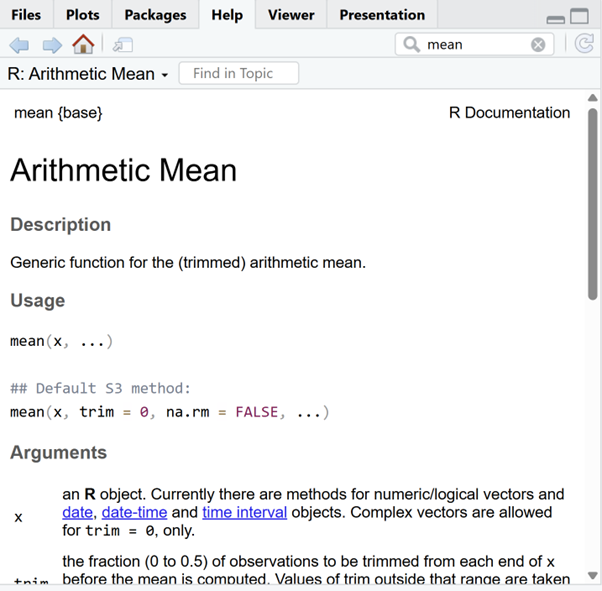
RStudio help interface.
Image 1 of 1: ‘Diagram showing a data frame with numeric, character, and logical vector columns.’
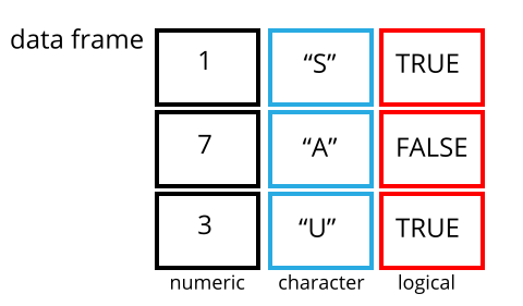
Image 1 of 1: ‘Bar plot showing the number of females, males, and undetermined individuals captured.’
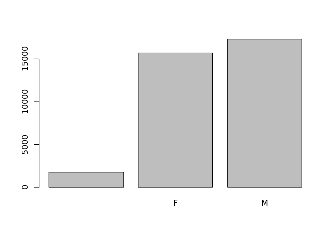
Image 1 of 1: ‘Bar plot showing female, male, and undetermined individuals in the specified order.’
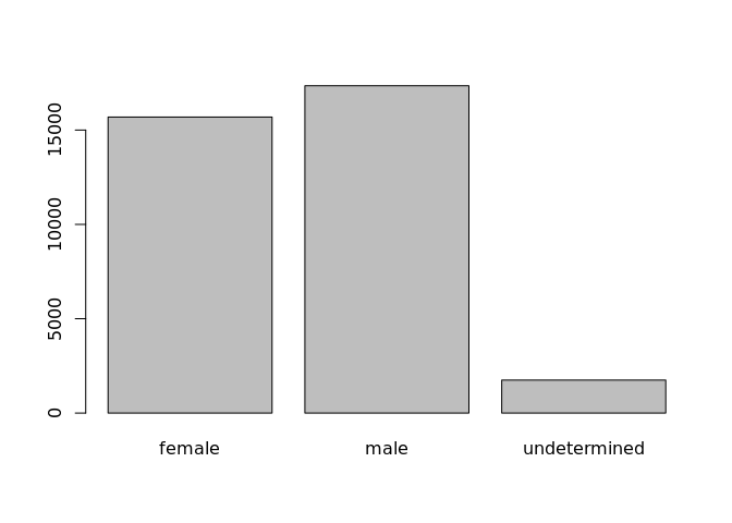
Image 1 of 1: ‘Diagram illustrating the pivot_wider transformation.’
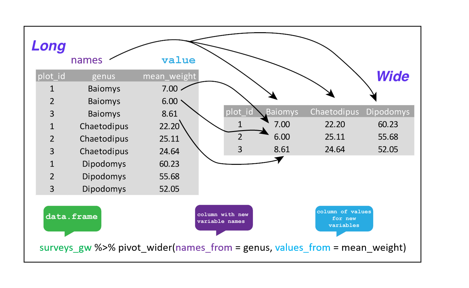
Image 1 of 1: ‘Diagram illustrating the pivot_longer transformation.’
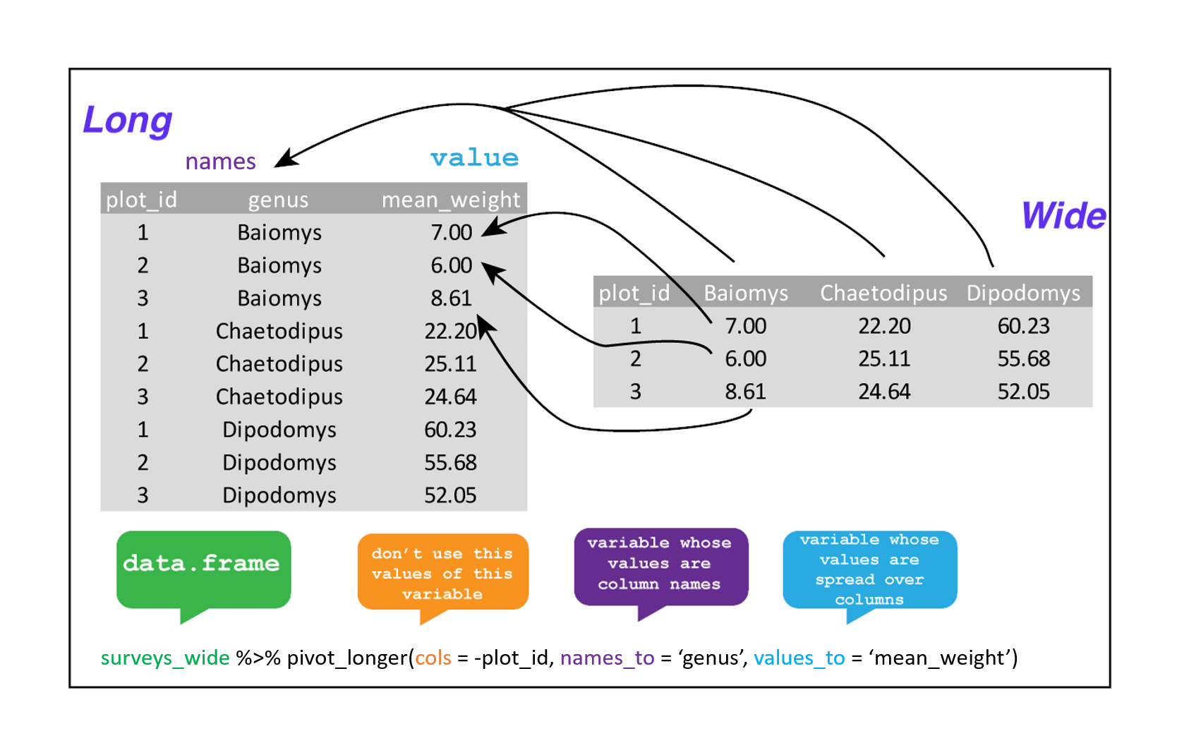
Image 1 of 1: ‘A blank ggplot canvas with no axes or data plotted.’

Image 1 of 1: ‘A ggplot canvas with weight on the x-axis and hindfoot_length on the y-axis but no data points.’
Image 1 of 1: ‘Scatter plot of weight versus hindfoot length for all species in the surveys_complete dataset.’
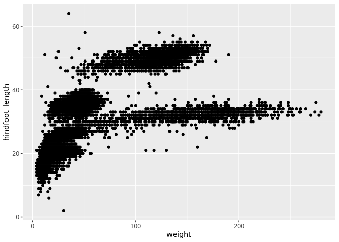
Image 1 of 1: ‘Scatter plot of weight versus hindfoot length generated by adding geom_point to a stored ggplot object.’
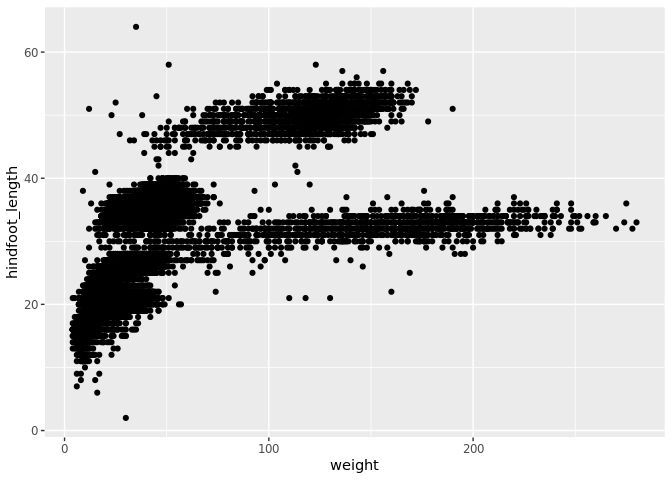
Image 1 of 1: ‘Basic scatter plot of weight versus hindfoot length.’
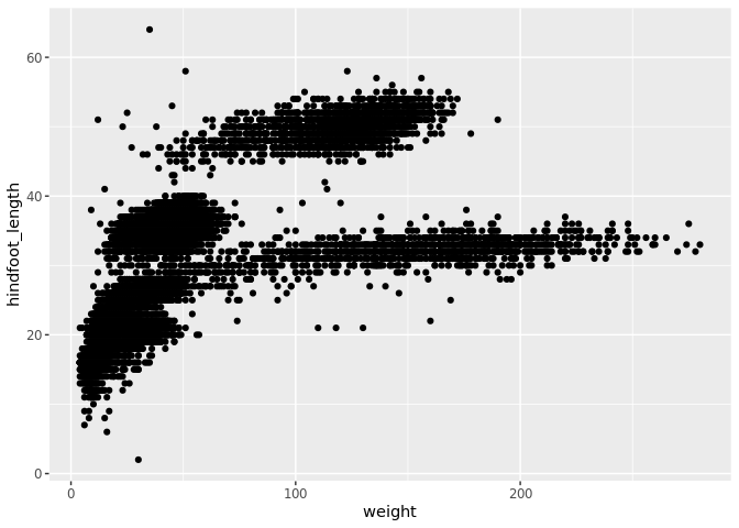
Image 1 of 1: ‘Scatter plot of weight versus hindfoot length with transparent points to show overplotting.’
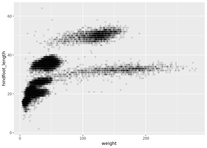
Image 1 of 1: ‘Scatter plot of weight versus hindfoot length with all points coloured blue.’
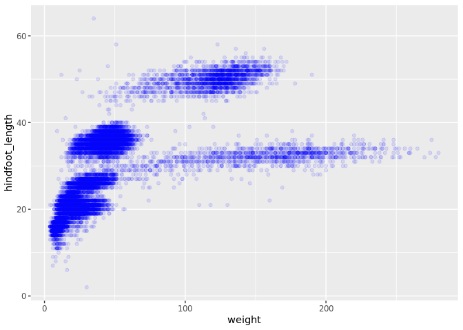
Image 1 of 1: ‘Scatter plot of weight versus hindfoot length with points coloured by species ID.’
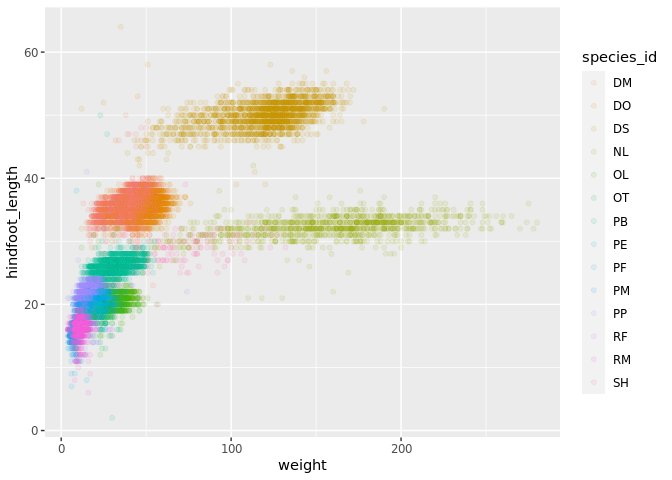
Image 1 of 1: ‘Scatter plot of weight by species ID with points coloured by plot type.’
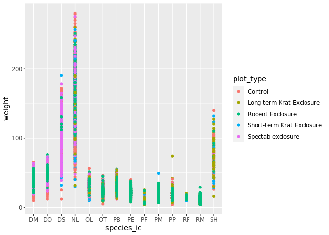
Image 1 of 1: ‘Boxplot showing the distribution of weight for each species ID.’
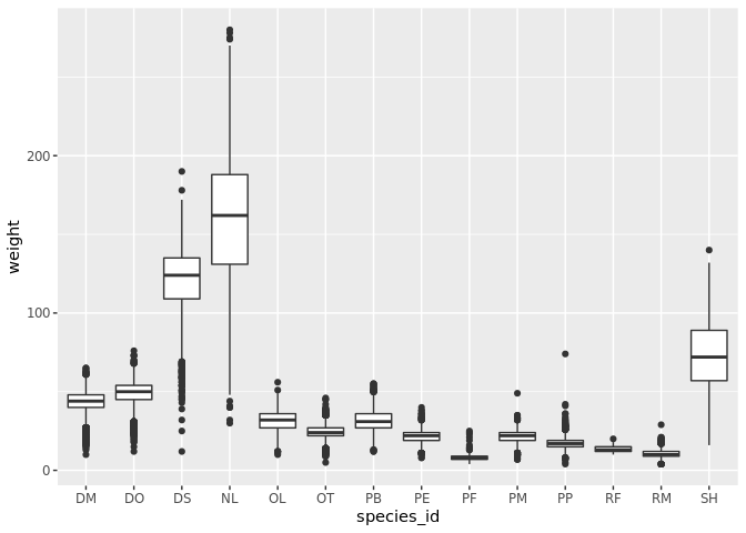
Image 1 of 1: ‘Boxplot with jittered data points overlaid in tomato red showing the distribution of weight by species ID.’
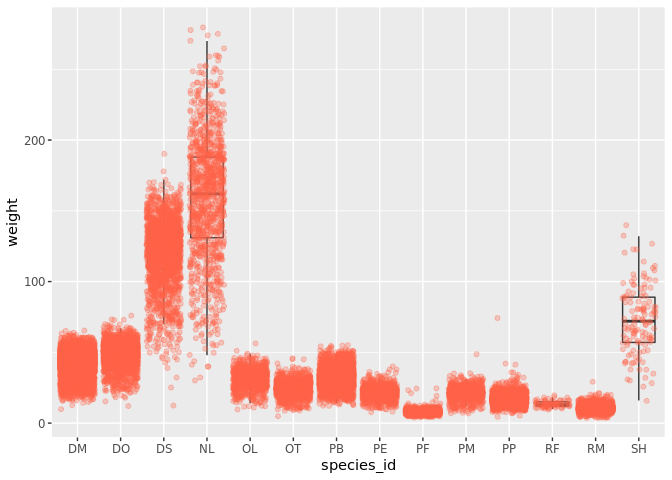
Image 1 of 1: ‘Line plot of counts over years with all genera combined into a single line.’
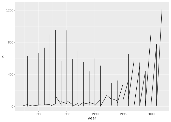
Image 1 of 1: ‘Line plot of counts over years with a separate line for each genus.’
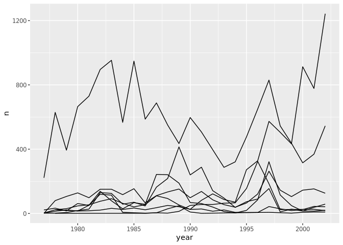
Image 1 of 1: ‘Line plot of counts over years with each genus shown in a different colour.’
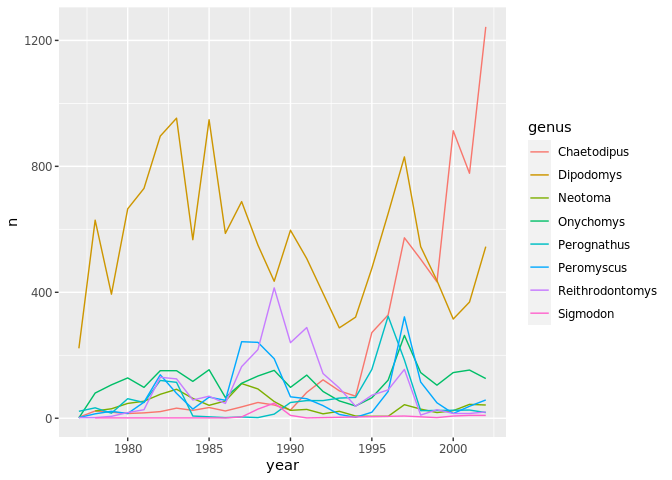
Image 1 of 1: ‘Line plot of counts over years by genus created by piping data into ggplot.’
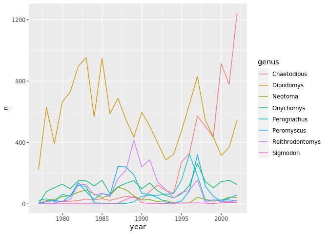
Image 1 of 1: ‘Line plot of counts over years by genus created by chaining data manipulation and ggplot with pipes.’
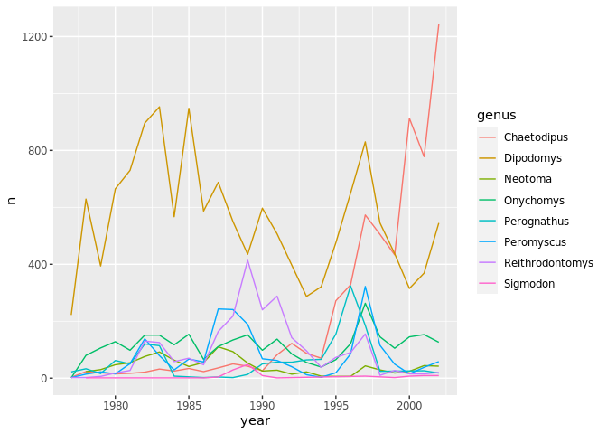
Image 1 of 1: ‘Faceted line plots showing counts over years for each genus in a separate panel.’
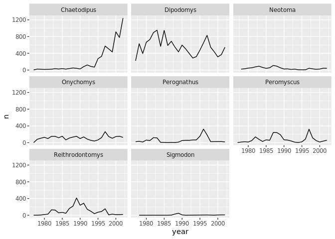
Image 1 of 1: ‘Faceted line plots showing counts over years by genus, with lines coloured by sex.’
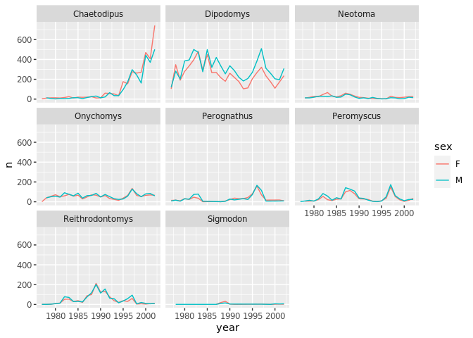
Image 1 of 1: ‘Grid of faceted line plots with sex in rows and genus in columns.’
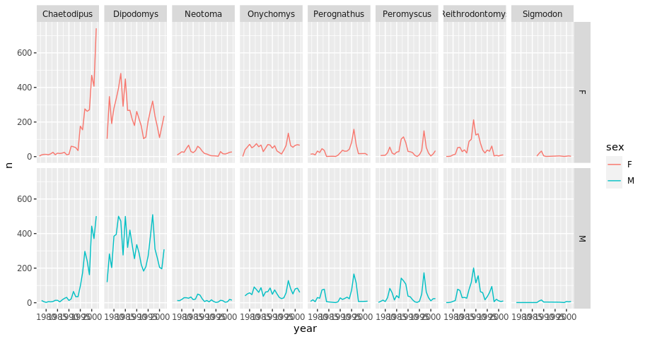
Image 1 of 1: ‘Faceted line plots arranged in a single column with one panel per genus.’
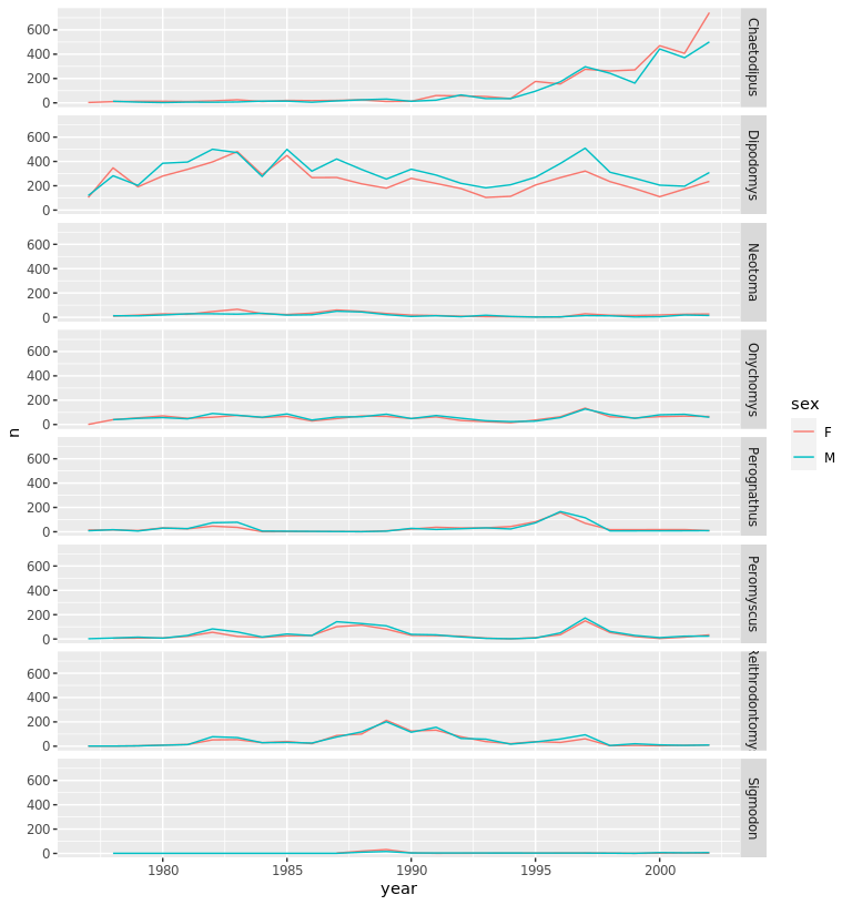
Image 1 of 1: ‘Faceted line plots arranged in a single row with one panel per genus.’
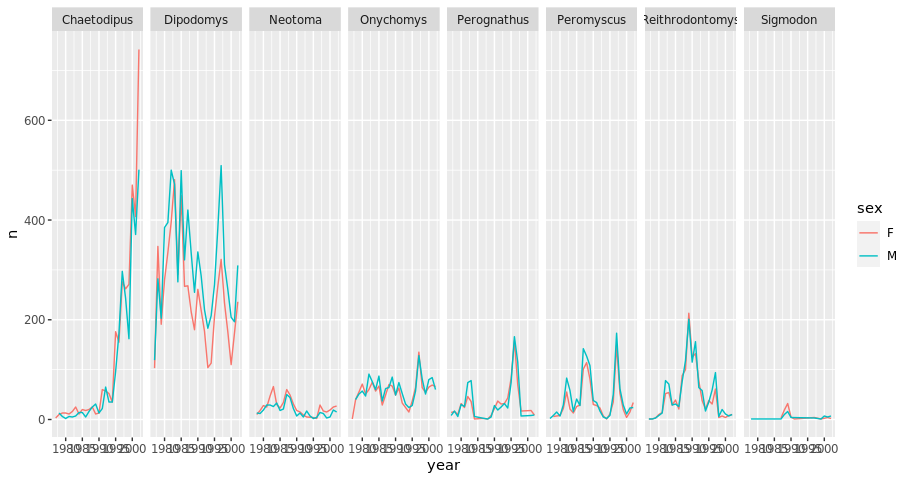
Image 1 of 1: ‘Faceted line plots by genus and sex using the black and white theme.’
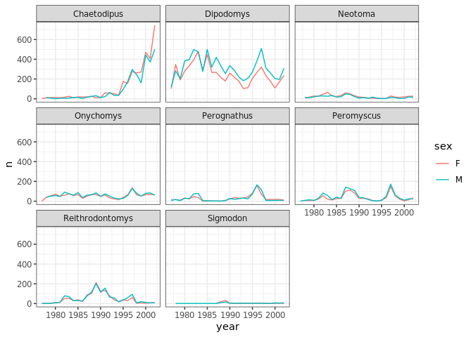
Image 1 of 1: ‘Faceted line plots showing average weight over years for each species ID using the black and white theme.’
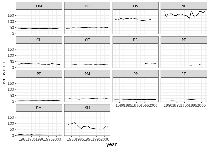
Image 1 of 1: ‘Faceted line plots by genus and sex with descriptive axis labels and a title.’
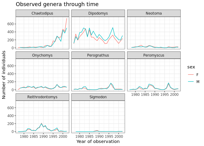
Image 1 of 1: ‘Faceted line plots by genus and sex with increased font size on all text elements.’
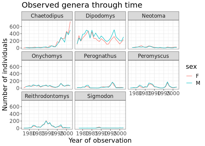
Image 1 of 1: ‘Faceted line plots by genus and sex with rotated x-axis labels for readability.’
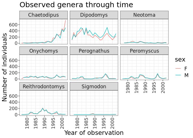
Image 1 of 1: ‘Boxplot of hindfoot length by species ID with the custom grey theme applied.’
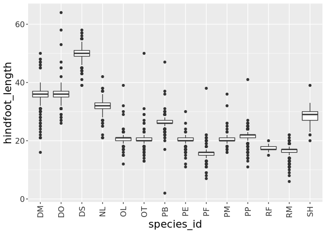
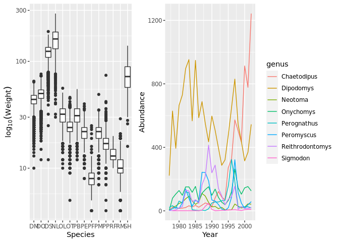
Image 1 of 1: ‘Two plots arranged side by side: a boxplot of species weights on the left and a line plot of genus abundance over time on the right.’
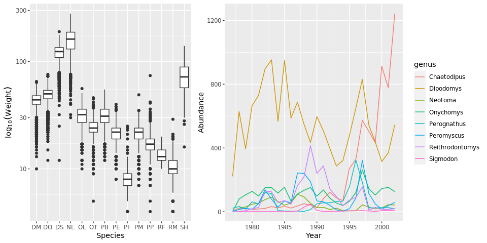
Image 1 of 1: ‘Combined plot saved with ggsave showing the weight boxplot and abundance line plot side by side.’